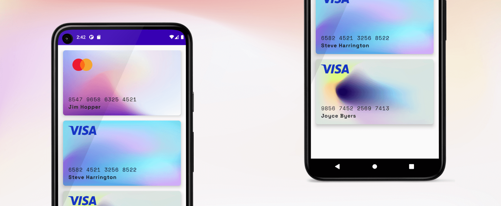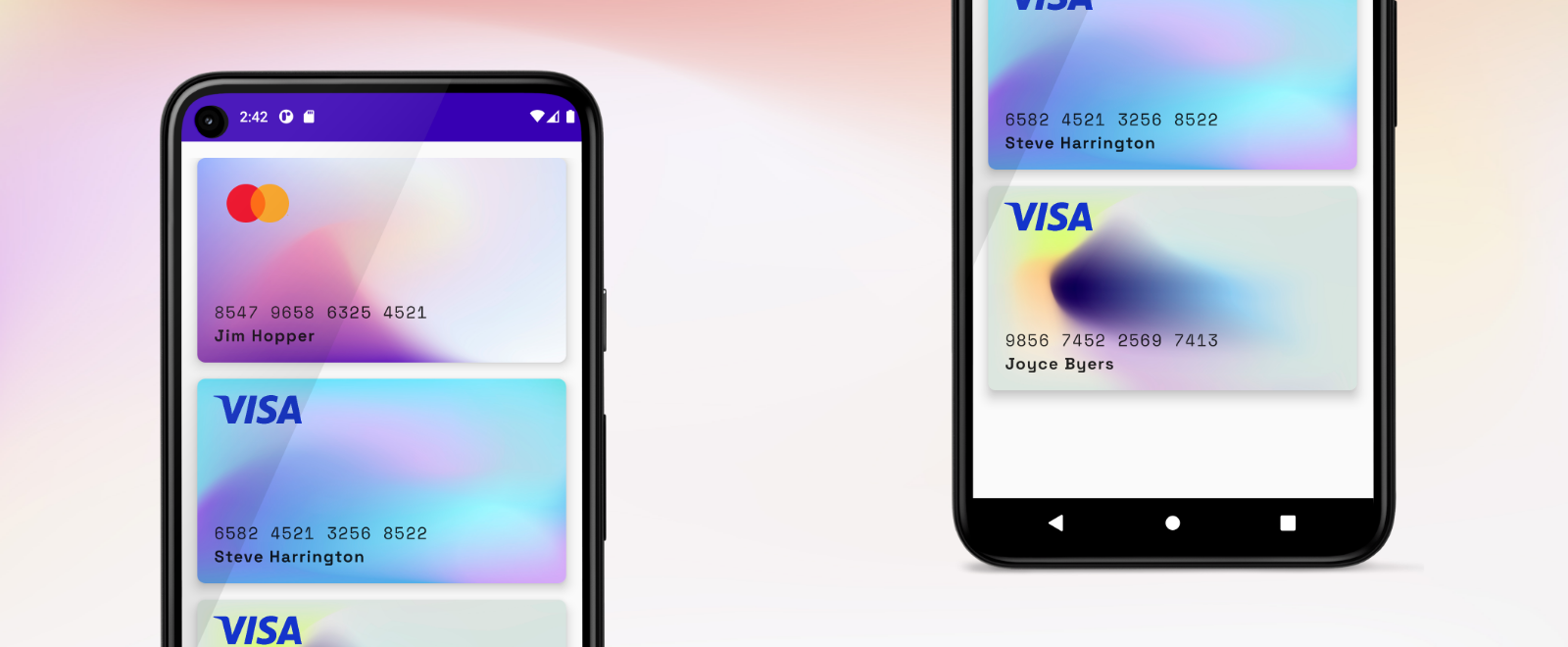
Fast Tutorial - Beautiful credit cards with JetPack Compose
Written by Danubius IT Solutions
This fast tutorial shows how to create a list of credit cards with JetPack Compose. Just follow the steps and try out Google’s declarative UI framework today!
Prerequisites
-
Latest version of Android Studio
-
JDK 11 or higher
-
Physical or virtual device for testing
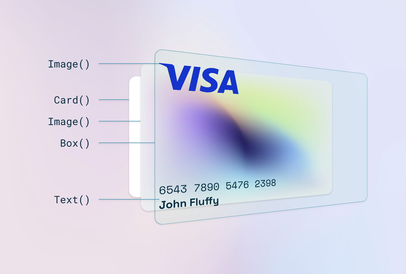
Anatomy

The idea is very simple: Create a card, add a mesh gradient image, put over a box layout and take the parts to the right places. The key is the Box layout. With this composable, you can put elements in the 4 corners of the box. See the reference docs for more about Box layout.
Prepare
First of all, create a new Android Project and select Empty Compose Activity. Then clean up the sample code.
Get the image and font resources:
Put image resources to /res/drawable.
Create a new resource folder for fonts: /res/font and copy font files (Space Grotesk bold for cardholder name and Space mono regular for card number).
Create CreditCard() composable
Create a new Kotlin file under the ui package and name it CreditCard.kt. Start a new composable function and add empty Card() component:
@Composable

func CreditCard() {
    Card(
        modifier = Modifier
            .height(200.dp),
        shape = RoundedCornerShape(8.dp),
        elevation = 8.dp
    ) { }
}
Add Image() inside card content for the mesh background:
@Composable
fun CreditCard(cardInfo: CardInfo) {
Card(
modifier = Modifier
.height(200.dp),
shape = RoundedCornerShape(8.dp),
elevation = 8.dp
) {
Image(
painter = painterResource(id = R.drawable.card_mesh),
contentDescription = "Card Background",
contentScale = ContentScale.FillBounds
)
}
}
The FillBounds content scale will expand the image to match the size of the card.
After the image, put a new Box() layout with some padding:
Box(modifier = Modifier.padding(16.dp)) { }
Add Image() to the Box TopStart position and load the Visa logo.
Box(modifier = Modifier.padding(16.dp)) {
Image(
painter = painterResource(id = R.drawable.visa),
contentDescription = "Visa",
modifier = Modifier
.width(86.dp)
.align(Alignment.TopStart)
)
}
Prepare the font faces to use for card number and cardholder texts. Open ui/theme/Type.kt and create new font families:
val SpaceMono = FontFamily(
Font(R.font.space_mono_regular)
)
val SpaceGrotesk = FontFamily(
Font(R.font.space_grotesk_bold, FontWeight.Bold)
)
Now you can use them in other composables.
To align the card number and the cardholder name under each other, we will use a Column() wrapper component and put the Text() inside it.
Box(modifier = Modifier.padding(16.dp)) {
Image(
painter = painterResource(id = R.drawable.visa),
contentDescription = "Visa",
modifier = Modifier
.width(86.dp)
.align(Alignment.TopStart)
)
Column(modifier = Modifier
.align(Alignment.BottomStart)) {
Text(
text = "5435 9876 1234 6543",
fontFamily = SpaceMono,
letterSpacing = 1.2.sp,
fontSize = 16.sp
)
Text(
text = cardInfo.cardHolder,
fontFamily = SpaceGrotesk,
letterSpacing = 1.1.sp,
fontSize = 16.sp
)
}
}
Showtime
The CreditCard() composable is ready to use, put inside your app component:
@Composable
fun DiCardApp() {
DanubiusCreditCardTheme {
Column(
modifier = Modifier
.fillMaxHeight()
.padding(16.dp),
verticalArrangement = Arrangement.spacedBy(16.dp)
) {
CreditCard(cardInfo = CardInfo(
backgroundDrawable = R.drawable.card_mesh,
providerDrawable = R.drawable.mc,
cardNumber = "8547 9658 6325 4521",
cardHolder = "John Fluffy"
))
}
}
}
More than one
Create a new data class to hold the attributes of a CreditCard() composable, for example CardInfo.kt.
data class CardInfo(
val cardNumber: String,
val cardHolder: String,
val providerDrawable: Int,
val backgroundDrawable: Int
)
Create a fake list of cards:
val cards = listOf(
CardInfo(
backgroundDrawable = R.drawable.card_mesh,
providerDrawable = R.drawable.mc,
cardNumber = "8547 9658 6325 4521",
cardHolder = "Jim Hopper"
),
CardInfo(
backgroundDrawable = R.drawable.card_mesh_2,
providerDrawable = R.drawable.visa,
cardNumber = "6582 4521 3256 8522",
cardHolder = "Steve Harrington"
),
CardInfo(
backgroundDrawable = R.drawable.card_mesh_3,
providerDrawable = R.drawable.visa,
cardNumber = "9856 7452 2569 7413",
cardHolder = "Joyce Byers"
)
)
Change Column() component to LazyColumn() and load the items of cards list.
LazyColumn(
modifier = Modifier
.fillMaxHeight()
.padding(16.dp),
verticalArrangement = Arrangement.spacedBy(16.dp)
) {
items(cards) { card ->
CreditCard(cardInfo = card)
}
}
Refactor the CardInfo component to display CardInfo object attributes. See the final implementation below:
@Composable
fun CreditCard(cardInfo: CardInfo) {
Card(
modifier = Modifier
.height(200.dp),
shape = RoundedCornerShape(8.dp),
elevation = 8.dp
) {
Image(
painter = painterResource(id = cardInfo.backgroundDrawable),
contentDescription = "Card Background",
contentScale = ContentScale.FillBounds
)
Box(modifier = Modifier.padding(16.dp)) {
Image(
painter = painterResource(id = cardInfo.providerDrawable),
contentDescription = "Visa",
modifier = Modifier
.width(86.dp)
.align(Alignment.TopStart)
)
Column(modifier = Modifier.align(Alignment.BottomStart)) {
Text(
text = cardInfo.cardNumber,
fontFamily = SpaceMono,
letterSpacing = 1.2.sp,
fontSize = 16.sp
)
Text(
text = cardInfo.cardHolder,
fontFamily = SpaceGrotesk,
letterSpacing = 1.1.sp,
fontSize = 16.sp
)
}
}
}
}
That’s it! You can play around with other backgrounds, fonts, and layouts. You can find the full example on GitHub in this repository. Don’t forget to ⭐️ the repository.

Interested in IT solutions tailored to your business? Contact us for a free consultation, where we'll collaboratively explore your needs and our methodologies.


